Welcome!

Hello and welcome! I would love to share with you my love of paper crafts, altered art, mixed media, card making, scrap pages and fun! Come right in, sit right down, have a cup of your favorite beverage and relax!

Saturday, July 27, 2013

 I created this card for the Online Card Class, where you are to use a die cut in a different way.What I did here was place the flower and the grapefruit outside the circle die so they would lay outside the circle but still be in tact.  I then colored the House Mouse image with some Copics markers. I used a piece of velum and banner cut it by hand. I also colored the flowers by the sentiment with some lavender ink. Trying to follow color schemes and techniques and a bit of the card sketch for this week.


This card was for last week's online card class where you were to make a card with a Seasonal stamp set and make a non-seasonal card. I chose the hat and You're Cool from a snowman set and kept with the online card class theme colors. I tried to use the various colors with one stamp set but I ended up using one stamp set for the typewriter and the sentiment on the typewriter paper, then I also used some other stamps to add color. Inside is a computer generated sentiment that says, "Hat's off to you!" and stamped the same hat inside.

Sunday, July 21, 2013

This card was a challenge for me, but I really like Tammy Tutterow's style, and she had a great tutorial in my Online card class! I had to try it! On her tutorial, she stamped the wood grain background, but I didn't have a wood grain stamp. I did have a nice embossing folder with this wood grain pattern by Darice. I ran it through some cored card stock, and I tried the dark brown cored card stock by Tim Holtz first and sanded it so the core would show through, but it was too dark. So I still used cored card stock but I used the back of it which is a more manila color and simply ran some Distress Walnut Stain over the embossed pattern. I did make the flowered background by stamping various flower images and coloring them in with copics and I did water color the background in Baja Blue ink. I then simply drew in my own stems and doodles. I finally found some plain seam binding so I could stain it myself. and that was fun to put the ink on my craft sheet, mist it with water and run my seam binding through it by mopping up the moisture of the water and inks with the seam binding and I crinkled it up and scrunched it so it would be wrinkled on purpose.There is a small vellum circle in the middle, and I did stitch along the edges and also in the circled stamped image. I did not have any felt to stain, so I used old book paper instead I made three layers of book paper and stained the top layer with Distress Peeled Paint, but I'm such a dork I put the card together with the book print words going upside down. I still like how the overall effect looks!

This card above was fun because the technique was  from week one and the technique was to create your own background with the class theme colors but first you had to make a penciled plaid background with a ruler and then stamp the inked flowers over that. Then erase the pencil lines after that, and the flowers should look a little textured. Mine kind of look that way, but I probably should have made more lines in my plaid. Then the next step was to emboss a nice sentiment in silver embossing powder on vellum. This helps soften the loud colors of the stamped background.
 This is a cute little round card made with my Circle Spellbinders. This card was from the second week of my Online Card Class.We simply just folded a piece of card stock and placed the round spellbinder die just over the top of the fold, so when the die is cut it is connected at the fold but still opens like a card. Then I used some wood designer paper and cut it out the same size circle and adhered to the card front. Then I found some coordinating blue dotted designer paper and cut it a few sizes smaller than the card. Then the next step was to make your own resist colored background. This is fun because you use Versamark clear embossing ink and stamp several flowers or one large flowered background stamp on white watercolor paper. Heat emboss with white embossing powder. Then on a craft sheet, lay down desired ink colors, and here I chose Distress Peeled Paint, and I even put some Baja Breeze ink down and spritzed with water. Then I lay the heat embossed water color paper over the ink, turned it over and let it dry. The next step was to make a vellum flag and heat emboss with a greeting sentiment. I tied the end with a bit of solid faded orange bakers twine. Cute little thing, aint' it?


This is another star shaped card from week one, using the theme colors and making a striped background with scraps! What a cute way to use up your scraps at the end of your project! The use of vellum is popular in this class, and I rather like it! A great way to use some of the vellum stash I've had for quite awhile!


This is a star shaped card made for the Online Card Class I am taking. It's from Onlinecardclass.com
Once I knew the RGB codes, I printed the colors from my Cricut Imagine, and also cut the start shape from the stock images the Imagine stores. Then I simply followed the tutorial for this cute little card. The circular stamp is from a Birthday grouping, but I skipped the cupcake that goes with it. The heart is a cut out with a bunch of glitter added. The little star is a punch I had in my stash. Inside is a place for a nice stamped message.

Wednesday, July 10, 2013

I made this card for Onlinecardclass.com.
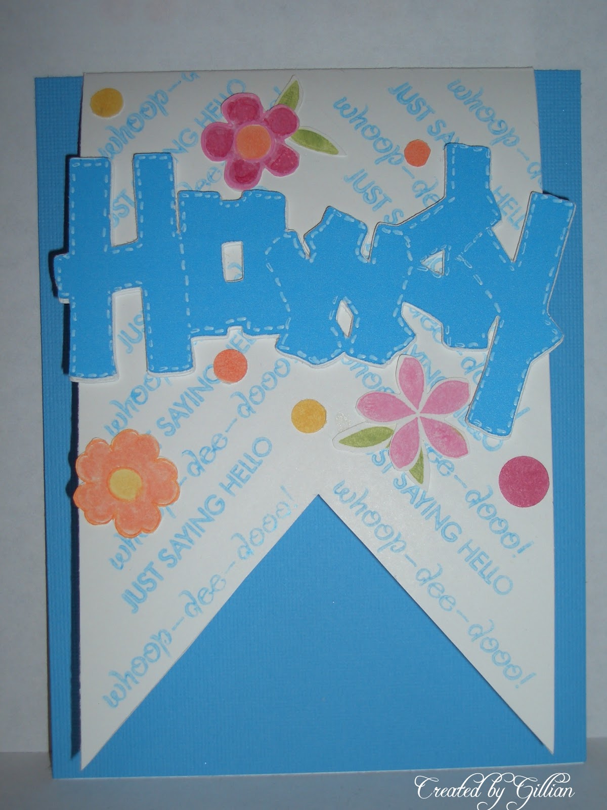
I used my Cricut to make the sentiment using the color RBG codes of my Cricut Imagine and cut the word Howdy out from the Old West Cartridge. I then cut out the same word five more times using white card stock and stacked them on top of each other to make a thicker, popped up sentiment. This was a technique from the onlinecardclass,.com
Then the next interesting thing was marking the card every half inch and stamp sentiments in a chevron style for the banner background. That was cool too. Then the banner is sandwiched inbetween the blue card base and another white card base of the same size (4-1/4 x 5-1/2). Then flowers and leaves are used in the class theme colors and added as embellishments. An inside sentiment is stamped in Versa Mark and white embossing powder is heated to create a nice white sentiment on the blue card base. More flowers added as embellishments. My inside sentiment simply states: Thinking of you today and smiling.
Fun card!

Sunday, July 7, 2013

Cards for fun, July and a challenge!


The first four cards here are from a card class my friend Katherine Anderson held. At the last minute, I had to go on a business trip and missed the class! However, Katherine saved all the cuts and I finished the cards at home. These cards are from StampinUp's Best of Flowers stamp set. These are some examples of what can be done with this set! Lots of fun!
The fifth card is a Victorian style vintage card I tried to make totally girly. I like to look at these beauties, but sometimes I have a hard time doing them! So I made myself go outside my box and attempted it. The image is one I found on free Printables in Pinterest. On my Pinterest board, under Printables, you will see the link to where this image is credited. She's so pretty! I love the Music Paper background it was printed on. I simply chose this image and printed it on card stock from my Epson printer. Then I incorporated the image with lace (three kinds)! Seam bindng lace, the little pom lace and some pretty lace I found at Hobby Lobby the other day. I added some pearls and aged some papers by sponging them, and then added the heart locket trinket. My next attempt I'll try to add more textured layers!
The bright red white and blue card was inspired by this card: http://www.cardscraps.com/blog/2013/07/04/happy-4th-with-six-sided-sampler/
but I didn't have the hexagon shapes.  Her card is so beautiful, I kind of cased it but made the changes using a 1 inch square punch instead.
The last card is for a new online class I signed up for. Today is the last day to enter the Pre-Class challenge 2, and I thought I'd try it! I had fun stitching and sponging this card for the challenge.

Sunday, May 26, 2013

This gentleman is ultra cool! I just love how he looks, secretive, smart and sexy in a handsome steampunk kind of way! This is from the Tim Holtz Time Traveler's Blue Print stamp set! I just love it! These guys are are just the ultimate in cool! I used Bazzil Almond Cream as the base to stamp the image in Distress Walnut Stain ink. Then I simply colored in the image with some Copics markers. I also stamped the stack of suitcases in Walnut Stain inks and colored that image in with Distress inks and a water color brush. I found some Bo Bunny timepiece paper and distressed the edges. I used the Tim Holtz ticket Soar in the corner and sponged around the edges with Distress Walnut Stain. I used a single Tim Holtz gear and a timepiece trinket I had in my stash. I tried to stain the timepiece trinket a little with Distress inks as it was a little too gold and bright at first.Then I simply popped up the images with some sponge pop dots and it is done!
This is one cool dude! I fell in love with the Tim Holtz Time Travelers Blue Print stamps the moment I saw them! These guys are just too cool! These images really make me wish I could travel back in time and meet them! Even work with them in some kind of spy or subterfuge in a steampunk secret mission! For the Good of course! This is the first image I worked with. I simply stamped in Momento Brown ink and then colored him slightly and lightly with a barage of tans and beige Copics markers. I polka dotted the background with the same Copics markers. The frame is a Sizzlets frame set where both edges cut so you have an immediate framing of your desired image. I used Bazzil almond cream card stock for the stamped image, and Bazzil chocolate truffle for the frame. I stamped the gears in the background from this Time Traveler's stamp set. Just love how cool this guy looks!

Sunday, August 5, 2012

It's Just a Number

This should make a nice masculine card for a guy turning an age he may not really want to be! So I had these cute distressed papers that had numbers all over them. I also used the Tim Holtz Ranger numbers and sanded them a little and then added some Pearl color and some Ranger Distress crackle paint to age them.  I also covered 3 chipboard numbers with some number paper and stained the edges with Ranger Distress walnut stain. I colored the 687 numbers with some Baja breeze ink and also used some distress crackle on top of that. The center statement of It's Just a Number is done with a Dynamo letterer. I distressed and stained the almond cardstock where I placed the Dynamo letters. I added Clear Distress Crackle over the statement piece. Card is covered in a Wood Designer paper, but the numbers cover it up pretty well! LOL!

Kute little Koala

This is a cute little stamp from Whippersnapper. I had quite a few scraps of paper on my desk, so I just grabbed some older designer papers and cardstock and used up some paper stash to create this cute little Koala Birthday card. I used Copics to color him in. I had a little thumb punch of a cupcake so I used the same striped paper to punch out the cupcakes on the side. I also sort of followed an older SCS card sketch for the placement layout. Faux brads are used in the corners by using a very old industrial paper punch my DH gave me quite a few years ago. It was another fun one!

Sunday, July 29, 2012

Hi Y'all! Here is a selection of Birthday cards I've been working on. This first one is done with a selection of Kraft Core colored cardstock. I then used a border punch and stained all the edges with Ranger's Distress Ink Walnut Stain. 
 This second one I just tried to bring out the colors of the stripes  by using the purple cardstock, purple and orange Prima flowers, and an orange scallop around the sentiment.
 Here on this third card, I just loved the blue and yellow color combination and highlighted with the orange Prima flower centers and orange scalloped circle.
 This fourth and fifth card I just liked the Pinwheel designer paper which I highlighted with little gems in the centers. I used a Baja Breeze ink and sea colored cardstock and tried to pop it with orange and red.

 For these last two, I found this cute aqua cardstock and turquoise aqua designer paper, and I used an old Splitcoast card sketch with the large diamond square with three smaller diamond squares accenting it. I used a combo of Aqua and Baja Breeze, and it looks better IRL (in real life) than it does in these photos.

                                                      As always I just have fun making cards!

Monday, July 23, 2012

Mixed Media on Canvas

Here is one of my first attempts with mixed media on canvas. A while back a friend of mine sent me a link to Christy Tomlinson's She Art blog. You can view it here.  I certainly love her style. She makes it look like so much fun. I had to try it. I think I like how it turned out. I have a lot to learn yet, but this was tons of fun. So much so I want to do it some more!
This one may be my first in placement on the wall,
Then this one in the center, with the larger butterfly,

Then this one as the last placement.

These were done using designer paper, acrylic paint, light modeling paste mixed with some acrylic paint, and some rubber stamps and punches. I used all kinds of stencil templates to add the modeling paste. You can tell I obviously tried to do a few things that Christy shows how to do in her tutorial.  It was just fun to do!

Saturday, June 30, 2012

I tried this idea after viewing Gina K.'s blog. I liked how she trimmed the scalloped die cut at the edge of the paper. You can then use a rather large stamped image and trim it to fit your A2 size cards. You can use any style diecut, such as a Spellbinder's label's 8 or Labels 4. Just fit it at the edge and trim it! This style is nice to make because there are not too many layers so it mails nicely in a regular A2 invitation sized envelope. I still always put a card protector piece of cardstock over the card so it goes through the mail machines smoothly.
I love this sunburst style card! It is such a great way to use coordinating papers! The sunburst pattern is from a blog a friend referred to me.  Here is the link:Sun Burst Card Template © 2012, Andrea Walford, Paper Crafter’s Library; www.papercrafterslibrary.com
Andrea has a great tutorial on how to piece this together so it comes out so nice on your card! You can choose any occasion, any sentiment and any color to make it your own. I have used all sorts of colors using this pattern,  and all kinds of sentiments to fit the occasion of the card I choose to make. It makes such a bright, beautiful card!

Sunday, March 4, 2012

 I am sure you recognize the shape. I have artist friends and blogs I follow that alter the coolest things. They alter jars, silverware, picture frames, vintage tins, vintage windows and shelves and vintage clothing. Not I. Well I do that stuff sometimes. No, not today. Today I go and alter a toilet paper roll! Of all things, really!
I found though that this little gadget-- also known as a Doo Doo tube --you know, when your kids take an empty toilet paper roll and go around the house blowing it like a kazoo, making the Doo Doo sound!
Well this gadget also covers my desk duster really well, so it maintains it's shape. I didn't like the look of the plain brown toilet paper roll, so I took an aluminum soda can piece --yes I cut up an aluminum soda can so I could alter the metal. I ran that piece of aluminum through my Cuddlebug with a Tim Holtz embossing folder. I then adhered the aluminum piece to the roll with that fantastic double sided red tape. It adheres really well, and this needed strong adhesive. I also ran some brads up and down the seam so it would stick even better, and give it a more rustic look. I punched some holes all around the edges of the top and bottom and took some black lanyard lacing and wound the bottom and top with that. Then I took some acrylic paint, some ocean blue and bahama blue and painted the entire surface with Americana acrylic paint, and let that dry. When that was completely dry, I sanded off quite a bit of the blue paint, and then used some Perfect Pearl mica powders. I covered the surface with the medium and then spritzed the powders with water and painted the copper, bronze and a little gold on and let it dry. That was it! Now I have a rather cool duster cover. My altered doo doo tube!

Sunday, February 12, 2012

This beauty is a design by Dee or Deelight in our SCS stamping group. I love, love, love this design, the colors, and the technique used to make this ultimately cool masculine card. The color is an awesome SU blue ink. Dee had some wonderful shiny silver designer paper, and that was put into a gears theme embossing folder, then swiped on the up-textured side with black ink. Very neat effect. Labels two Spellbinders was used, and then blue sponging around the stamped motorcycle image while the image was still inside the Spellbinders die! Then she tied a washer around the panel and added three silver brads. Very cool. Oh, and various gears where stamped on the background with white ink. Inside was a chain link stamp, and a You're the Best stamped image. Awesome! And Totally Rad!
This card  was designed by Carol - a new Carol-haha! I think we have three now!
She used a fish stamp and embossed it after stamping in three different colors. Nice rounded corners, and a great theme for men!
This card was designed by Laurie. Laurie had some great old German music papers and I took the liberty to stamp in lightly direct to paper with the red ink pad. I also distressed the edges. The word Love was put on a Spellbinders die cut and brads were used to adhere it. Neat Date Stamp used for the theme. Nice black and white ribbon attached with the Tim Holtz tiny attacher. Fun valentine to give to a Guy!
This card was designed by JoAnn. She used the Tim Holtz theme embossing folders, and Stampers Anonymous sentiment stamps. I love her use of male patterned papers and distressing the embossed images and edging around the DP. Nice copper clasp holds the card  in place and another sentiment is stamped inside.
This is the inside of JoAnn's card. (above).

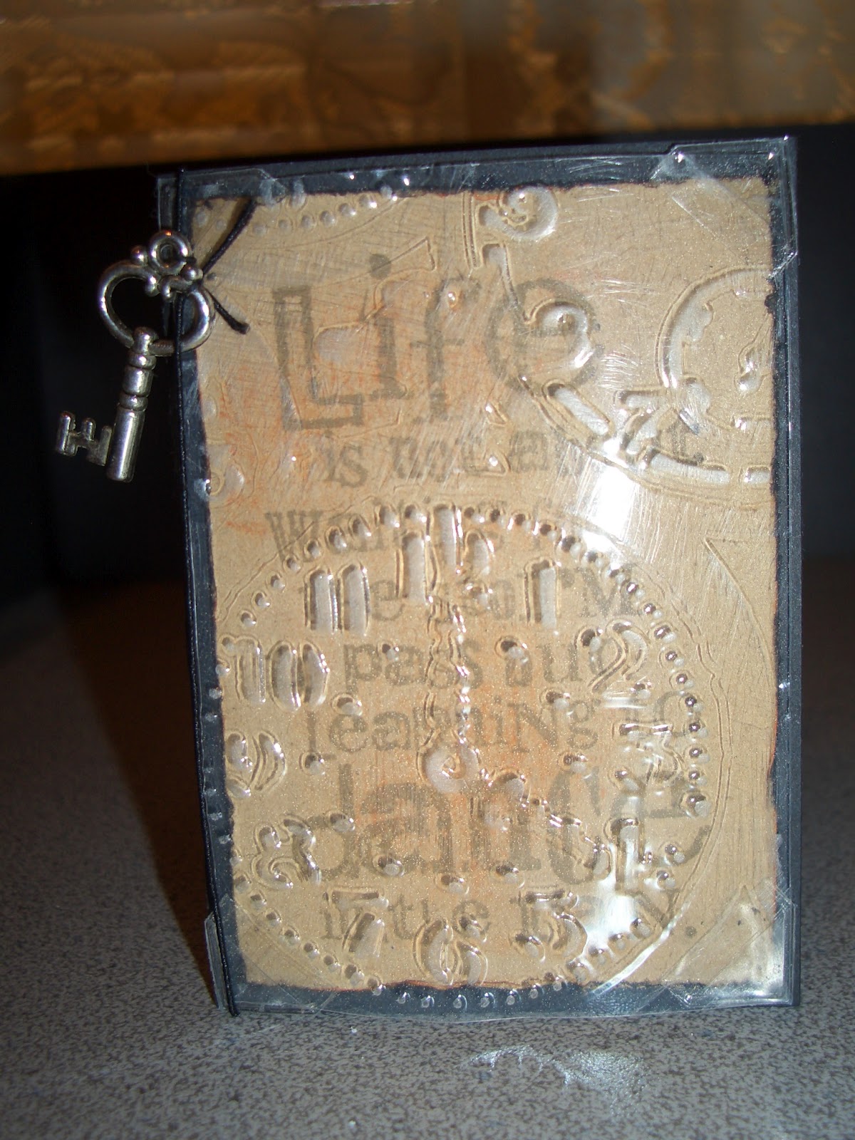
 This is Danette's design. Danette did an ATC! (Artist's Trading Card). Danette used the clear acrylic and passed it through a Tim Holtz embossing folder, and sanded it slightly to bring out the image since it was so clear. Then she had clear pocket corners to tuck the acrylic sheet into on top of the tan sentiment piece, stamped with a Tim Holtz Stampers Anonymous sentiment. Inside is an embossed image swiped with color to bring out the impression as shown below here.

Showing the cute little envelope and key that went along with Danette's design.

Below is my design for the swap. I simply used some cool DP I found at Archiver's something along the lines of a Pear Tree I think. All the paper designs looked masculine to me. Then I added Tim Holtz gears I embossed and cut out and then swiped with Distress Walnut Stain ink. The stamped images and sentiments are a Gears theme from Technique Tuesday. I attached the stamped image panel with the Tim Holtz Tiny Attacher. Cuttlebug die cut corner. I also attached a little key from 7 Gypsies with Glossy Accents glue.

 This awesome card was designed by Katherine. She used all SU colors and stamps. This one is from the Surfer group. I love this image stamped in that pretty blue! I love how she surrounded the image with the bold, bright yellow and orange. The inside panel was water color paper wet down with a spritzer with water. Then the inks from the stamp pads were used by pressing the lid of the stamp pad down onto the ink pad and using water and a paint brush to place on the water color paper. We dried it with a heat gun and then pressed the sumburst embosing folder onto the paper and Oila! A beautiful sunburst impression to go with the Surfer! Very Cool Indeed!


Another one of my design, using a different designer paper.
Thanks for looking at my Masculine Cards this week!

Saturday, February 4, 2012

Masculine cards for a swap

Here are some cards I made for a Masculine Card Swap on SCS.


Sure had a fun time making! I used several Cricut cuts from the Heritage cartridge. I also used the Cricut Imagine cartridge JT. It has a nice steampunk feel to it. I chose several masculine papers and Heritage cuts that looked masculine. Some of the labels are from the Heritage cartridge too.